BRAND ARCHETYPE
Rebel
Romantic
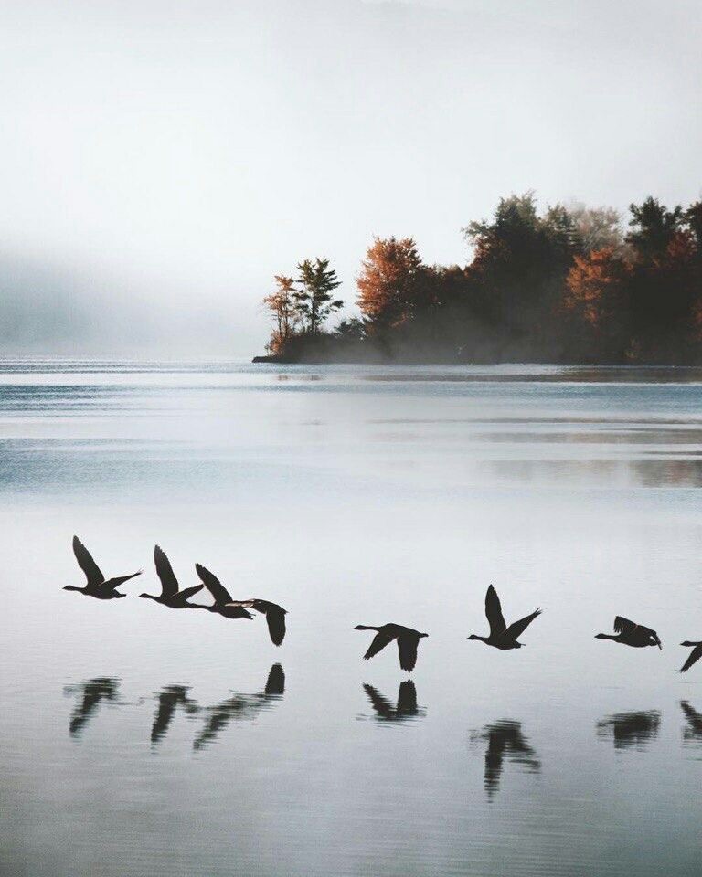
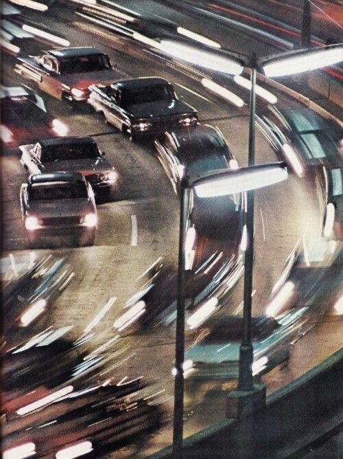
A fusion of two archetypes held in productive tension: the Outlaw who breaks rules with aesthetic precision, and the Explorer who finds meaning in solitude, weather, and physical landscapes.


A fusion of two archetypes held in productive tension: the Outlaw who breaks rules with aesthetic precision, and the Explorer who finds meaning in solitude, weather, and physical landscapes.
Every visual and copy choice should trigger specific emotional and psychological responses. These are the states the brand is engineered to evoke.
Drawn from fog-wrapped coastlines, worn leather, weathered concrete, and the quality of Pacific Northwest light just before rain. Neutrals that feel alive.
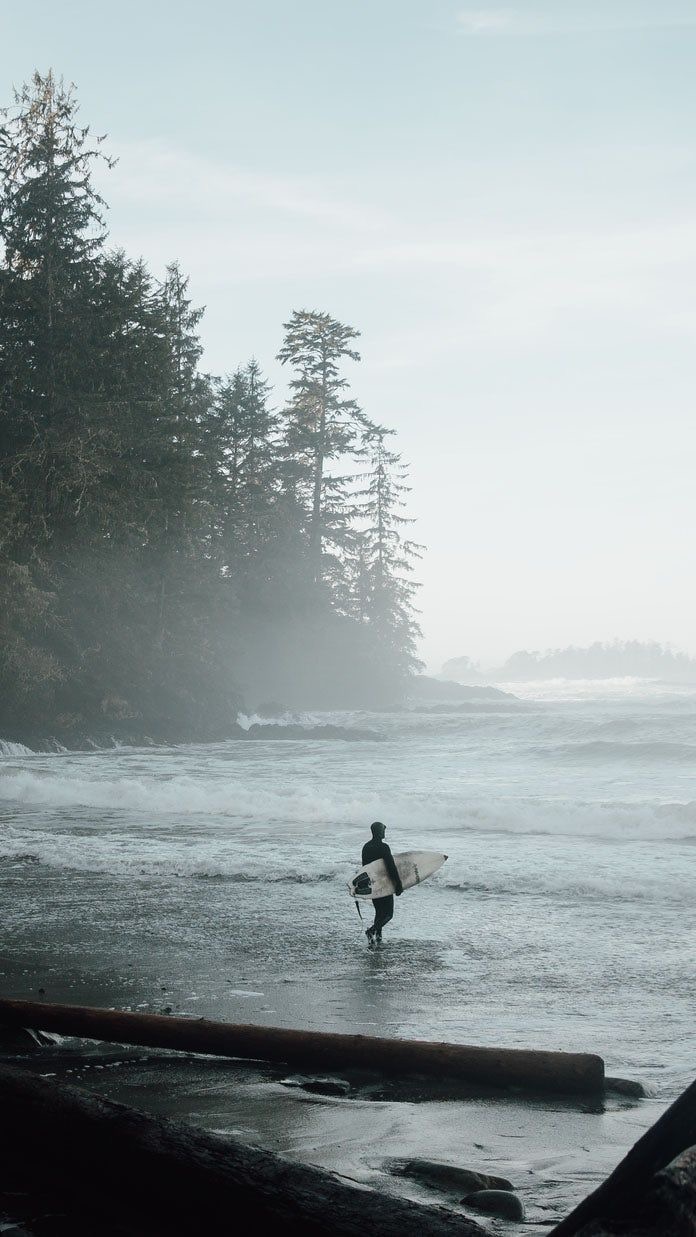
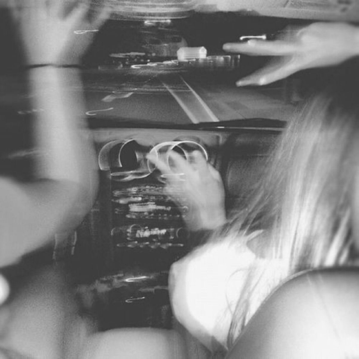
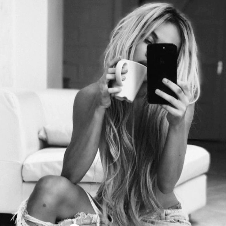
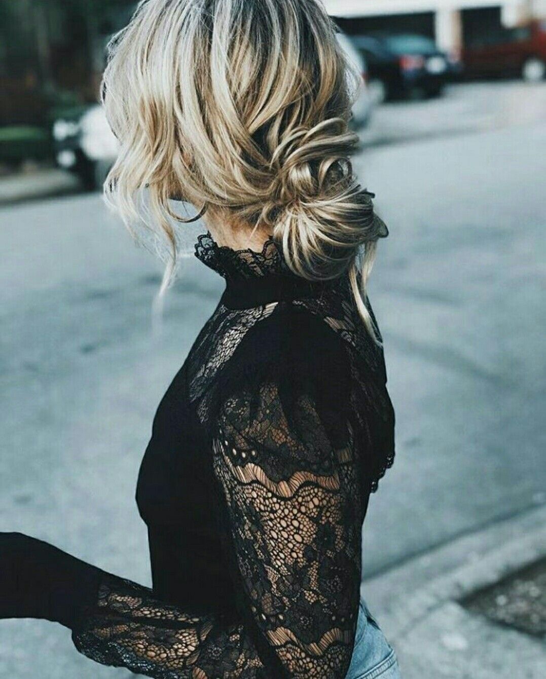
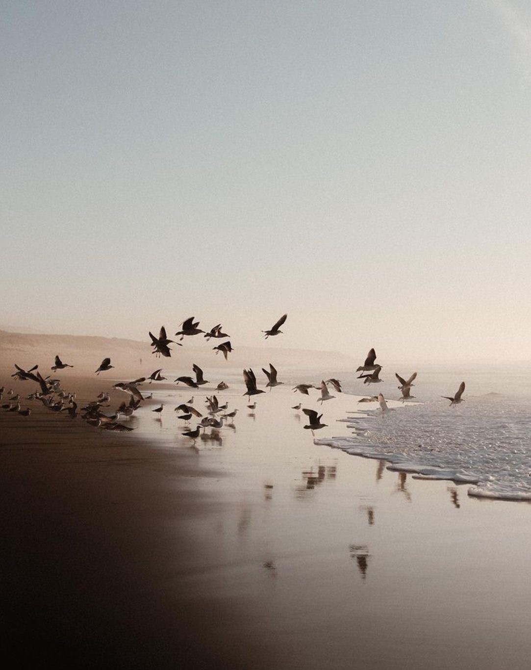
Every image should feel like it was stolen from a moment that didn’t know it was being watched. Raw texture, atmospheric light, real movement.
Every image should feel like it was stolen from a moment that didn’t know it was being watched. Raw texture, atmospheric light, real movement.
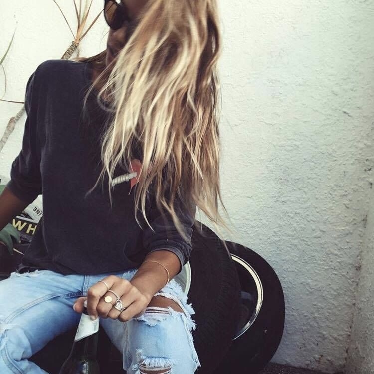
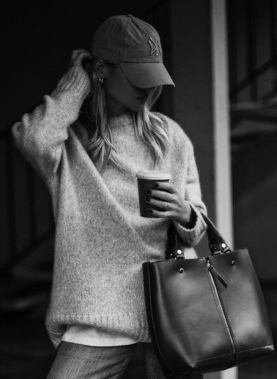
She moves through the world with a quiet confidence that doesn’t announce itself — it’s felt. Every choice, from the way she knots a shirt to the way she orders coffee, is instinctive and unhurried.
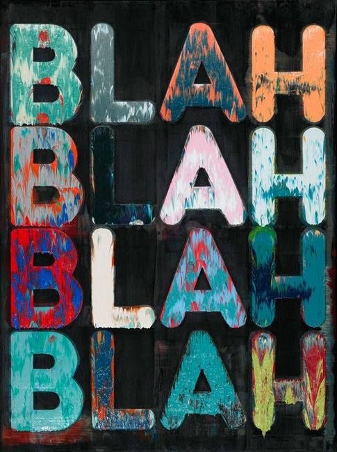
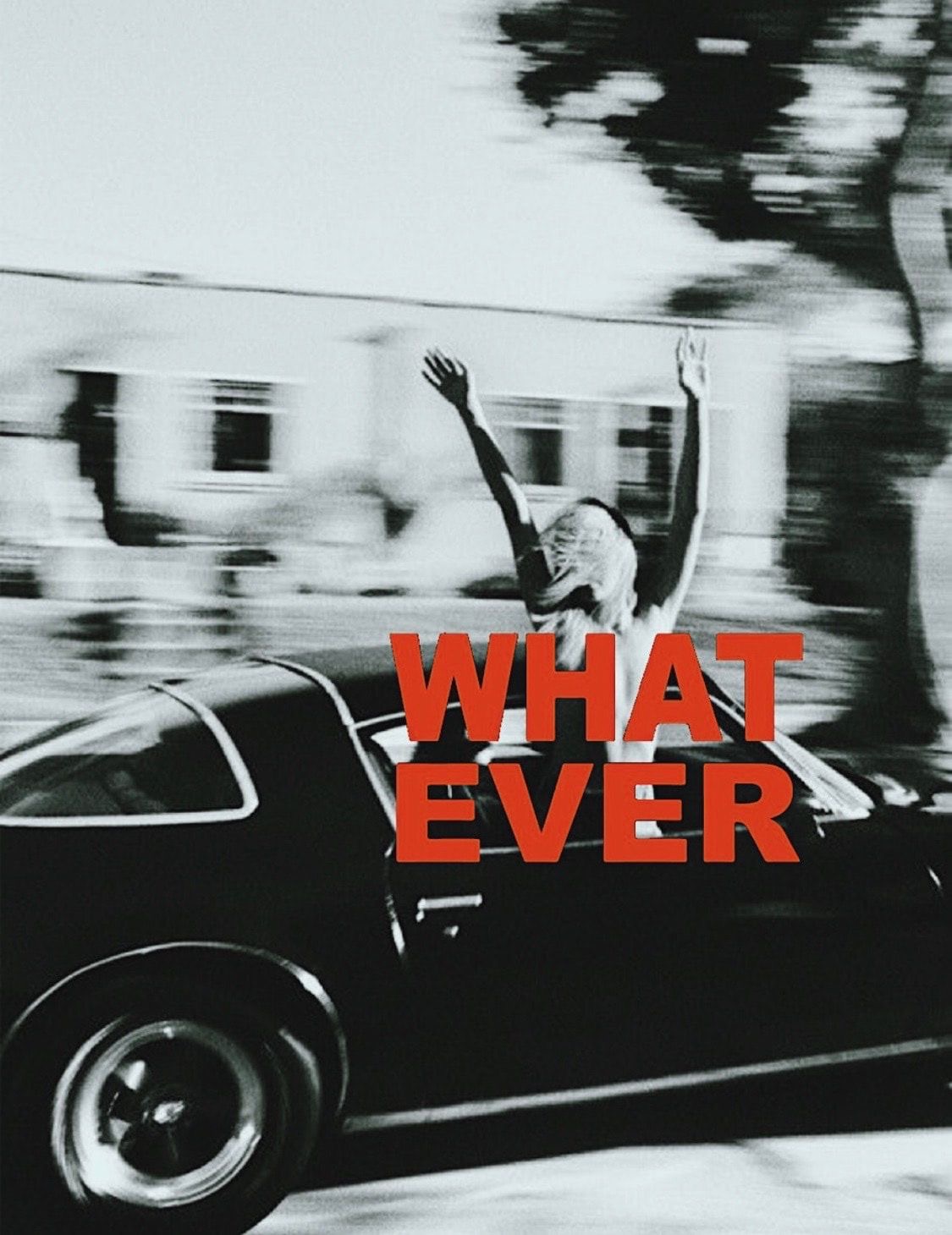
The brand speaks the way it dresses. Nothing extra. No exclamation points. Short sentences that land like facts. Lowercase is acceptable when it serves the tone.
“the fog came back. made coffee anyway.”
“whatever. it’s yours.”
“still trying to get it right. getting closer.”